London’s workforce, neighbourhood by neighbourhood
Workers in London’s education, manufacturing, retail and health care sectors are spread differently across the city. The latest Matter of Facts sheet brings those patterns into view through four maps of London’s planning districts.
Prepared by the London & Middlesex Local Immigration Partnership’s Fact Sharing Work Group, Part 61 uses 2021 Census data, with maps created by Western University’s Human Environments Analysis Laboratory. It offers a neighbourhood-level look at four parts of the workforce. The figures describe 2021, so they should be read as a snapshot from that year.
Education and manufacturing show different patterns
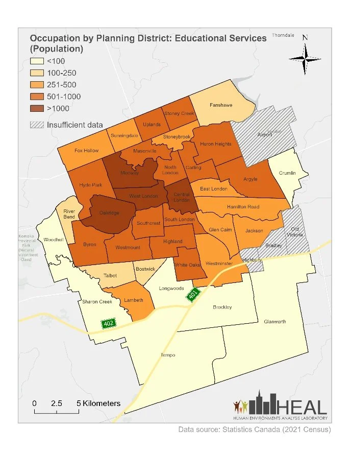
On the educational services map, four districts fall into the highest count category: Medway, West London, Central London and Oakridge. Each has more than 1,000 people employed in that sector.
Educational services includes different kinds of work within the sector. The figures should not be read as a count of teachers alone.
Source: Statistics Canada, Community Data Program, Table EO3775 — Ontario 3 — 2021 Target Group Profile. Map: Human Environments Analysis Laboratory, Western University. Reproduced from Matter of Facts, Part 61.
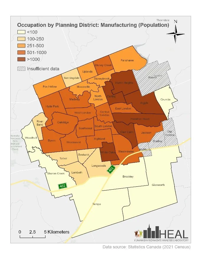
Manufacturing has a different pattern. Huron Heights, Carling, Argyle, Hamilton Road, Glen Cairn and White Oaks each have more than 1,000 people employed in manufacturing. These districts form a group across the eastern and southeastern parts of the city.
Comparing the two maps helps readers see how much the pattern changes across sectors.
Source: Statistics Canada, Community Data Program, Table EO3775 — Ontario 3 — 2021 Target Group Profile. Map: Human Environments Analysis Laboratory, Western University. Reproduced from Matter of Facts, Part 61.
Retail and health care have a wider spread
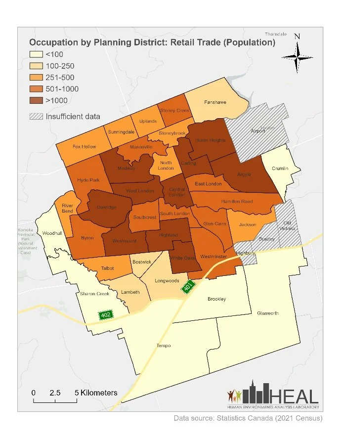
The retail trade map shows districts with more than 1,000 workers across several parts of London. Examples include Oakridge and Westmount in the west, White Oaks in the south, and Huron Heights and Argyle in the east.
Source: Statistics Canada, Community Data Program, Table EO3775 — Ontario 3 — 2021 Target Group Profile. Map: Human Environments Analysis Laboratory, Western University. Reproduced from Matter of Facts, Part 61.
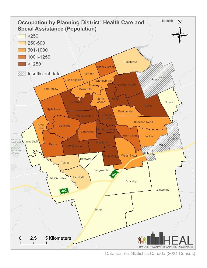
Health care and social assistance also has high worker counts across a broad area. Medway, Westmount, White Oaks, Carling and Argyle are among the districts shown in the map’s highest category.
This category covers health care and social assistance together. It cannot tell us how many people work in a particular profession, such as nursing.
Source: Statistics Canada, Community Data Program, Table EO3775 — Ontario 3 — 2021 Target Group Profile. Map: Human Environments Analysis Laboratory, Western University. Reproduced from Matter of Facts, Part 61.
Reading the maps carefully
Start with the legend on each map. The darkest shade represents more than 1,000 people on three maps, but more than 1,250 on the health care and social assistance map. The same colour does not always mean the same number.
The figures are counts, rather than percentages. A district with more workers in a sector does not necessarily have a larger share of its population working in that sector. Areas marked “insufficient data” should not be read as having no workers.
These maps also do not separate workers by immigration status. They cannot show how many immigrants work in each sector or identify current job openings.
The Matter of Facts series aims to help people understand the local population. These four maps give residents and community partners a way to explore London district by district. Find a familiar area and compare it across the maps. For partners considering neighbourhood outreach, the next step is to ask residents about their needs and compare this snapshot with current local information.